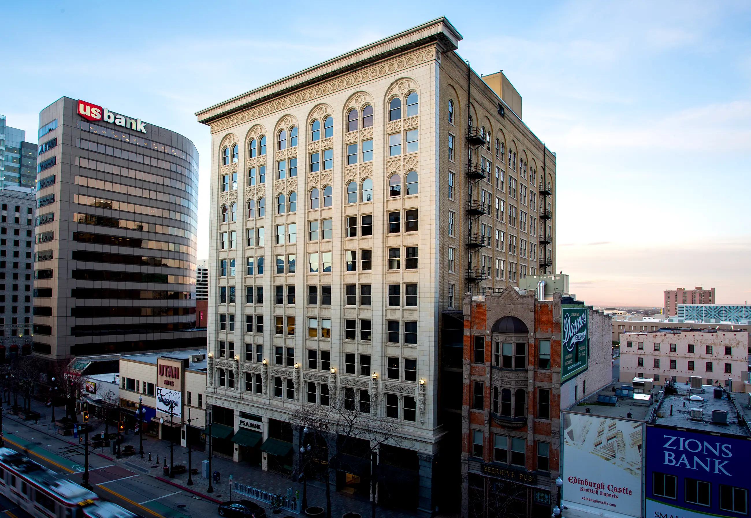
Kearns Building
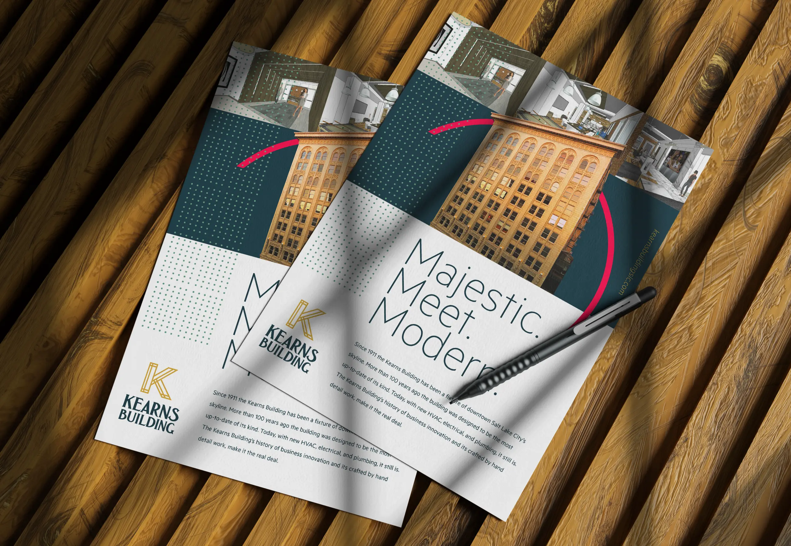
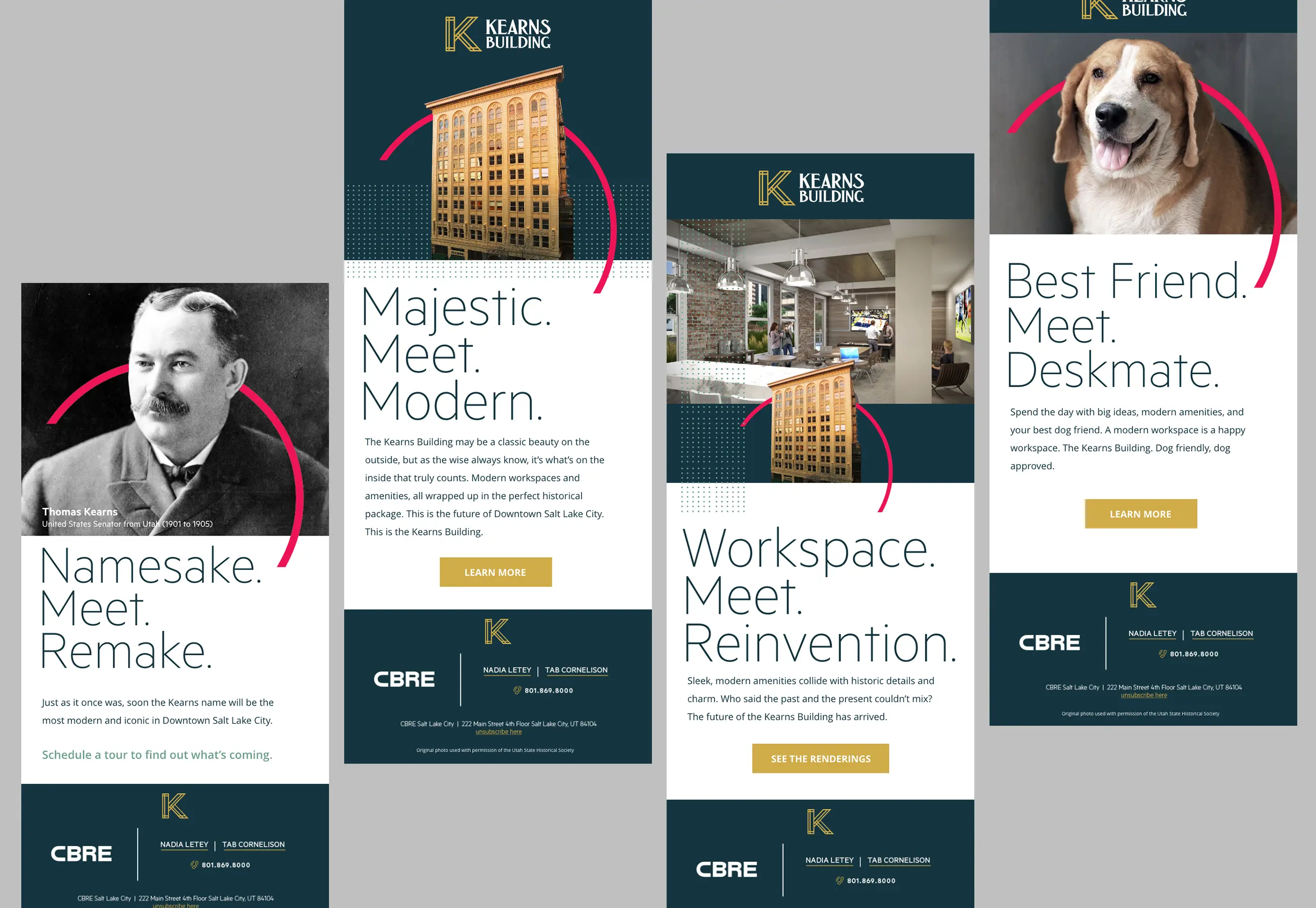
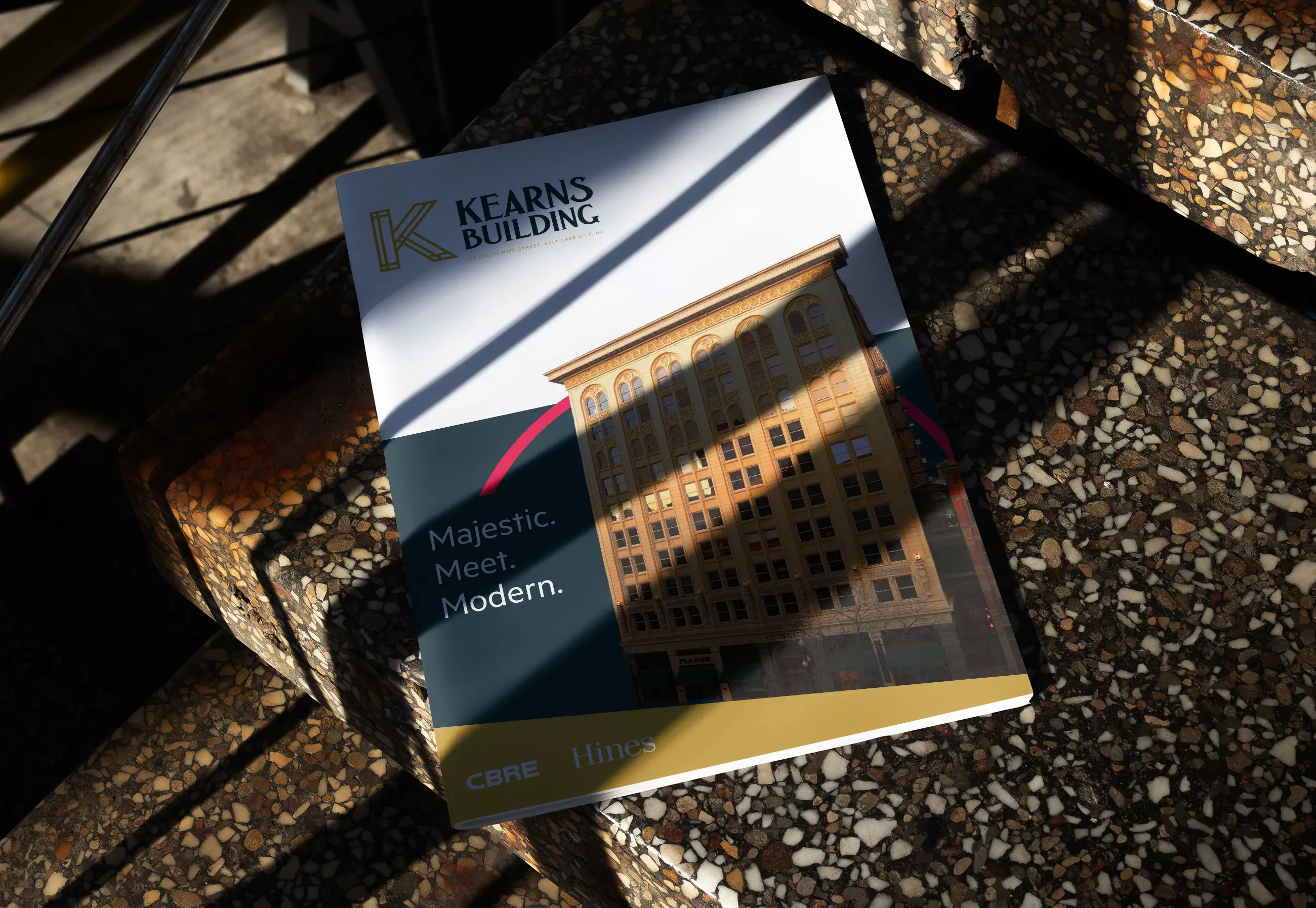
Built in 1911, the Kearns Building is a jewel on Main Street in Downtown Salt Lake City. But, in the face of fierce competition for office leases against brand new construction, the Kearns Building needed creative strategy and execution to help turn the tide in their favor. Instead of shying away from the building’s age and history, we leaned right into it with a building rebrand and lead generation strategy. 1911 was a unique time in art and architecture, sitting between the Art Nouveau and Art Deco eras (both prominently seen in the building’s design) we utilized a visual device from these art periods, the halo, as the visual centerpiece of the brand story placing our “hero” front and center. Through a series of different channels including email, social, and web, we worked with the developer and leasing agents to target millennial-led companies that would be enticed by the authentic history provided by the renovated building and its office spaces.
Services
- Brand Identity & Strategy
- Campaign
- Creative Direction
- Digital & Advertising
- Email & Social
Industries
- Real Estate Development
